Pulp Fiction
Digital Editorial Experience | 2023
A conceptual website inspired by Pulp Fiction, reimagined as a daily Los Angeles newspaper.

Guiding Question
What if the internet existed in Los Angeles during the 1970s?
This question guided the visual language, structure, and interactions of the site.
Experience Structure
Non-Linear Browsing
Inspired by the film’s narrative, the site moves between topics through scrolling and clicks, allowing unexpected jumps and shifts in content.
Interaction Approach
Unexpected Interactions
Buttons and scrolling trigger non-predictable reactions, breaking conventional navigation patterns and reinforcing a cinematic rhythm.

Visual Language
Editorial Meets Digital
A cohesive visual language built on editorial grids, restrained color palette, strong typographic hierarchy, and motion as a narrative tool.
Color Palette
A restrained color palette inspired by vintage print and newspaper ink.

Typography

Grid & Layout Logic
Editorial grid system allowing shifts and breaks in layout.

Structure & Screen Consistency
A stable editorial structure allows content to shift while maintaining clarity and consistency.

Graphics
Logo
A typographic logo inspired by vintage editorial design.

Pop up
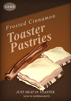
Advertisements and graphic elements inspired by the film.


Final Outcome
A cohesive digital editorial experience inspired by Pulp Fiction, combining structure, typography, motion, and cultural references

